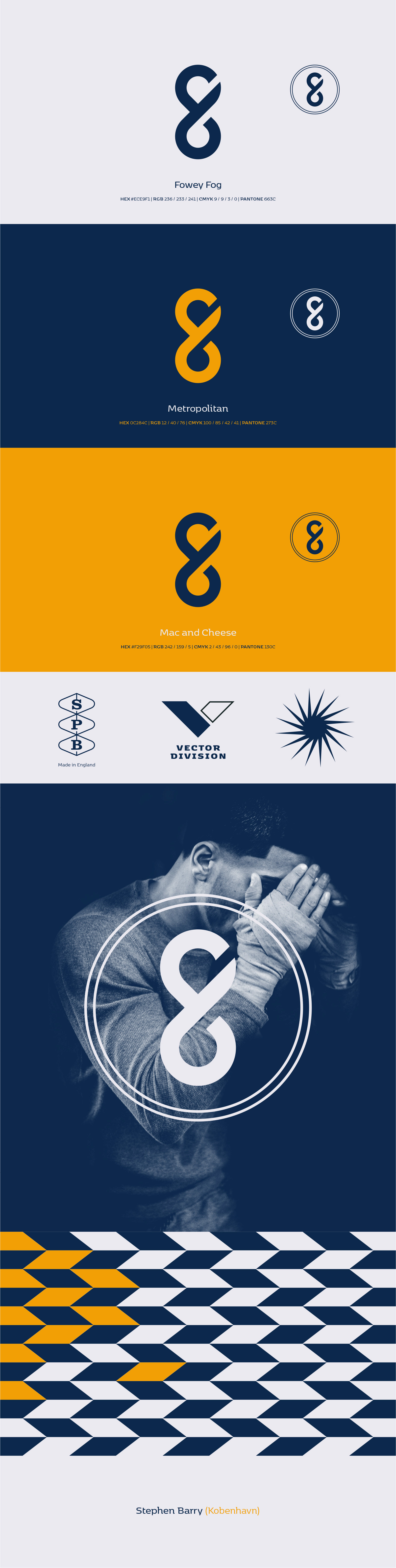


The logomark is a refined evolution of a previous version, stripped to a flat monogram for maximum clarity and versatility across print and digital. The word mark was deliberately omitted. Typography was selected to maintain balance and function. Kobenhavn by Morten Rostgaard Olsen was chosen for its structural adaptability in both headlines and body copy. Combined with original imagery, it supports distinctive layouts across personal brand outputs. The colour palette was precisely curated, anchored in personal significance to ensure visual consistency and authenticity.